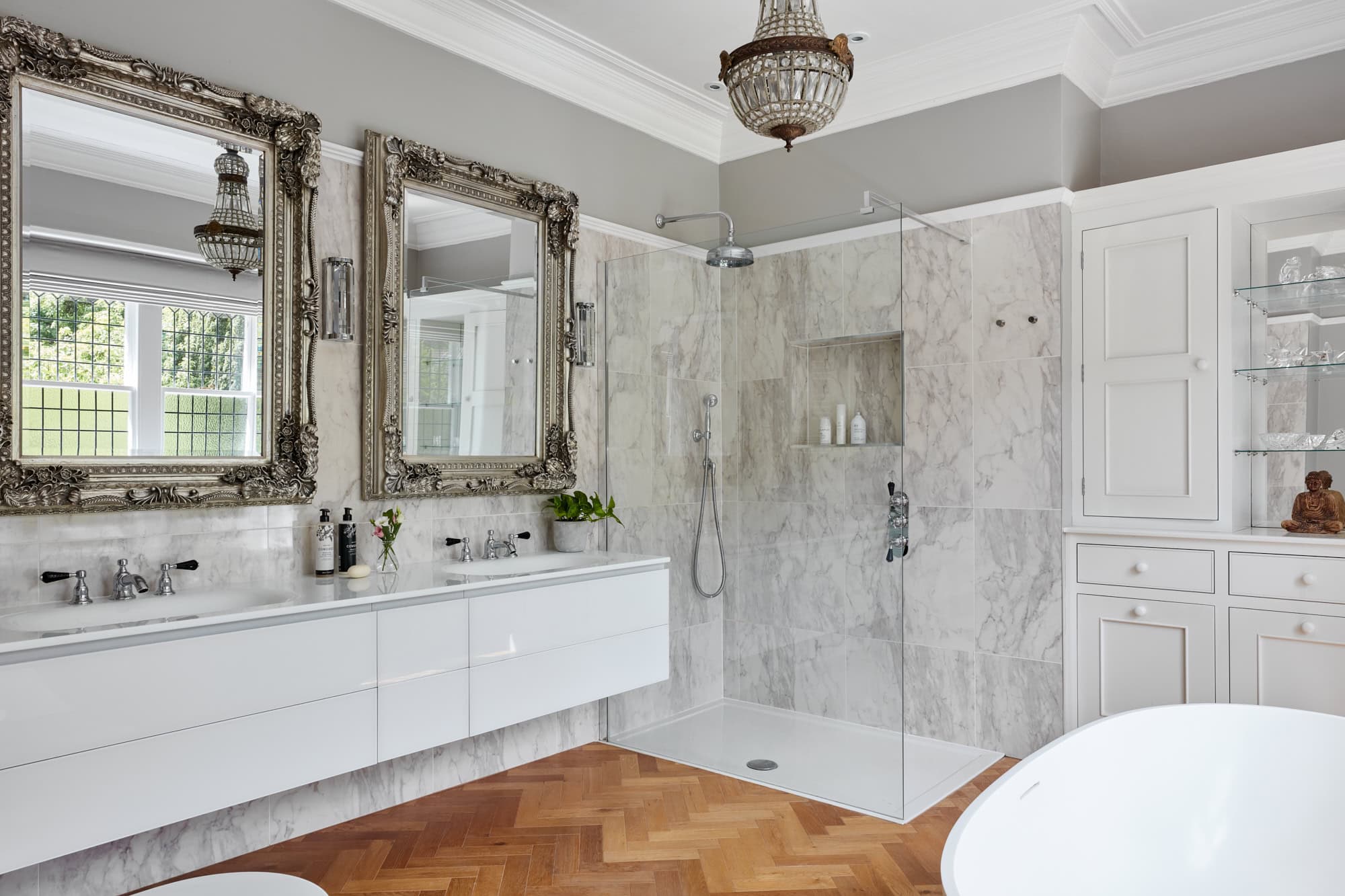
At AMC Interior Design, we believe that colour has the power to transform spaces, evoke emotions, and reflect individuality. Led by Ann Marie Cousins, our award-winning Yorkshire-based studio specialises in crafting interiors that are both bold and harmonious. Here are six unexpected colour combinations, endorsed by our design philosophy, that can elevate your home while keeping it timeless, functional, and uniquely yours.
Navy and burnt orange
We are huge fans of navy and its dynamic capabilities. Navy and burnt orange sit opposite each other on the colour wheel, creating a vibrant contrast. In one of our projects, deep navy, panelled walls were paired with a beautiful and glamourous burnt orange sofa, resulting in a space that is both sophisticated and inviting. The addition of gold and wooden accents further enhanced the luxurious feel without overwhelming the room.

Yellow and blue colours
Introducing a sunny yellow, like Dulux’s ‘True Joy,’ alongside navy can invigorate a space. A yellow can complement the depth of navy, creating a cheerful yet grounded atmosphere. The key to making blue and yellow work so harmoniously is understanding the balance of intensity. While yellow is often associated with energy and vibrancy, when chosen in more muted tones, it brings a warmth and playfulness to a room without sacrificing sophistication. A deep mustard or ochre hue, for instance, can create an instant focal point, while adding a touch of joyful exuberance to a luxurious scheme.
In this living space, the rich, deep blues create an anchor, while the mustard yellow offers a bold yet welcoming contrast. The bespoke navy-blue rug further grounded the ottoman, ensures that the colour story remains cohesive throughout the room. By using carefully selected shades, the overall effect was one of luxury and comfort, where each element felt thoughtfully curated.

Forest green and soft pink
Combining the richness of forest green with the delicacy of soft pink creates a balanced and refreshing palette. This pairing brings the tranquillity of nature indoors, offering a serene yet stylish ambiance. Incorporating biophilic elements, such as green, textured wallpapers with pink textiles, can further enhance this natural harmony. We found this colour pairing can make a modern dressing area feel warmer and more luxurious, while in a children’s bedroom it has created a playful and whimsical feel.

Black, cream and a warm orange or red
Elevate a neutral palette by introducing rusty or bold accents. A black and cream base provides a timeless foundation and is a favourite amongst interior designer because this monochrome effect feels warmer than white so it’s great for living rooms and bedrooms. However, when paired with a copper, terracotta, or even cherry red it is transformational and can lift a flat room in an instant. My favourite way to use this pairing is to pick a strong black and cream patterned fabric for curtains or wallpaper for a statement wall and then adding a pop of bright orange on a bedhead and layering abstract cushions or accessories. This combination is particularly effective in updating traditional spaces, infusing them with contemporary flair.

Teal and gold combination
Teal’s depth and vibrancy make it an excellent backdrop for gold accents. This combination exudes opulence and can be used to create focal points in a room. Whether it’s a gold-framed mirror against a teal wall or gold fixtures in a teal bathroom, the result is undeniably luxurious. A raft of celebrities have chosen to utilise gold in their homes and so it’s no surprise that people replicate the luxe-look. When gold is applied in spaces such as bathrooms it needs both a tether colour and also a paired neutral. Teal can look effortlessly chic, especially in a bathroom.

Nourishing green and coral combination
This combination might surprise you but nourishing, organic greens paired with vibrant coral tones can create an uplifting and energising environment. The green brings a calming, grounded feel, while coral injects just the right amount of playfulness and optimism. We love using this combo in spaces where you want to feel both soothed and inspired, like snugs, studies or creative workspaces. When balanced well, it brings together nature and vibrancy in perfect harmony.
Why samples and professional help matter
As much as we love exploring bold combinations, it’s important to remember that colour behaves differently depending on lighting, material, and surrounding finishes. That’s why we always recommend testing samples in your space before committing. What looks stunning in a showroom or magazine may feel entirely different in your own home.
A professional designer can help you interpret those colours within the unique context of your architecture, lifestyle, and preferences making sure your choices not only look great but work for you long-term.
While it’s tempting to chase the latest colour trends splashed across social media, we always advise clients to approach trends with care. What’s fashionable today may feel dated tomorrow. Instead, we encourage you to focus on what you love and what reflects your personality. Timeless design, layered with personal touches, will always outlast a passing fad.
At AMC Interior Design, we’re passionate about helping you discover the perfect colour combinations to reflect your style and enhance your home. Whether you’re looking to make a bold statement or create a subtle harmony, our team is here to guide you every step of the way.
