Let’s shine a light in all the right places
How are you? What a weird, tough start to 2021. New Year really feels like a lot longer than two weeks ago doesn’t it, but you know what? I don’t want to dwell on the headlines because this blog is a distraction. It’s an escape from day-to-day life. It’s where, just for a few minutes you can escape, look at some beautiful homes and peak into the thought process I go through when creating them.
I thought I’d kick things off this year with lighting because a well-designed lighting scheme can totally transform a room. The key word being design. For a long time, conversations about lighting centred on the practicalities, like wiring and positioning light switches and light fittings. And while these practical discussions are crucial, lighting can be beautiful in its own right and positioned correctly, elevate a room from bland to beautiful.
And so, today I’ll take you through my lighting thought process. Think layering, design, form and function. As always, give me a call or email me if you have any questions.
Step one – think practical
Where do you start? With the practicalities, as with all interior design projects. Lighting design features in both the mood board and floorplans and I start by looking at the space and layout of the room. I look at how it’s used at different times of the day and ask for details like where you sit and read with a cup of tea or stand to chop the veg for dinner.
I’ll look at how different rooms flow and connect with each other, how the light changes as you move from room to room. I’ll ask you about scenarios like coming home and stepping in through the front door into a dark hallway, juggling bags and keys. I’ll want to make sure the light switch is in just the right spot so that you can see where you’re going without tripping over. Yep, I really do dig into the details of your daily life. It’s so that I can understand how you move around your home during the day and how you use the space.
Once I’m happy that we’ve sorted out the layout and flow, I move onto step two – the four different types of light.
Step two – layered lighting
Welcome to the four different light sources, get the balance right here and light really will shine in all the right places. I’ve written a brief explanation for each one and thrown in a photo too to show you what I mean.

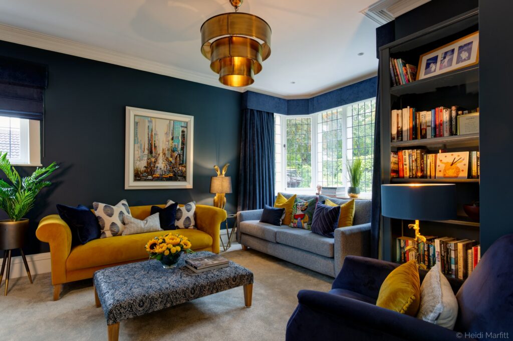
Ambient lighting is your base layer, your primary source of light. I might choose a pendant, chandelier or recessed ceiling downlighters. It all depends on the proportions and layout of the room and the design scheme. Often, I’ll choose a pedant or chandelier, complemented by downlighters to brighten dark corners or accentuate a feature (like patterned wallpaper).
Natural light – which direction does the room face? How much natural light does it get and how does that change during the day? Where are the doors and windows? This is what I’m thinking as I look around a room.


Task lighting helps you to see what you’re doing. Like a desk lamp so you can see your work or directional downlighters in the kitchen so you can chop your vegetables and keep all your fingers intact. Task lighting screams functionality, but it can be stylish too just like this family kitchen above where I chose three stylish pendant lights above the island. They look fabulous and you can see what you’re doing.
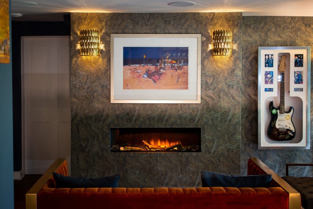
Accent lighting will draw attention to the features you want to accentuate in a room. Maybe there’s a piece of art on the wall just waiting to be bathed in a pool of light or maybe it’s the beautifully patterned wallpaper like in the image above. The wall mounted downlighters either side of the painting on the fireplace illuminating the wallpaper, picking out the pattern, while the brass finish complements the edging to the marmalade coloured sofa.

I guess the thing to remember is that lighting is flexible, it can multi-task. A row of directional downlighters highlight artwork on the wall and create atmosphere, especially when using a dimmer switch to dial the light up or down. And that floor lamp next to your comfy armchair that helps you to read without squinting? It also throws a gentle pocket of light on that corner of the room.
Step 3 – choose your lighting design
Now the fun bit – choosing the lighting. One thing I will say is that lighting design is huge these days. It’s easier than ever to find light fittings that hit the spot both budget and design wise. I love shopping for light fittings at Homesense as much as I love Pooky Lights and Tom Raffield.
But my starting point, whatever the budget, is what’s happening in the rest of the room. The wall colour, textures and finishes and proportions – how does the lighting work with them. Or does the scheme revolve around a bold statement chandelier? This why lighting features on the mood board and the floor plan – I can play around with it to see how it works with all the other elements in the room.
Go big and be bold
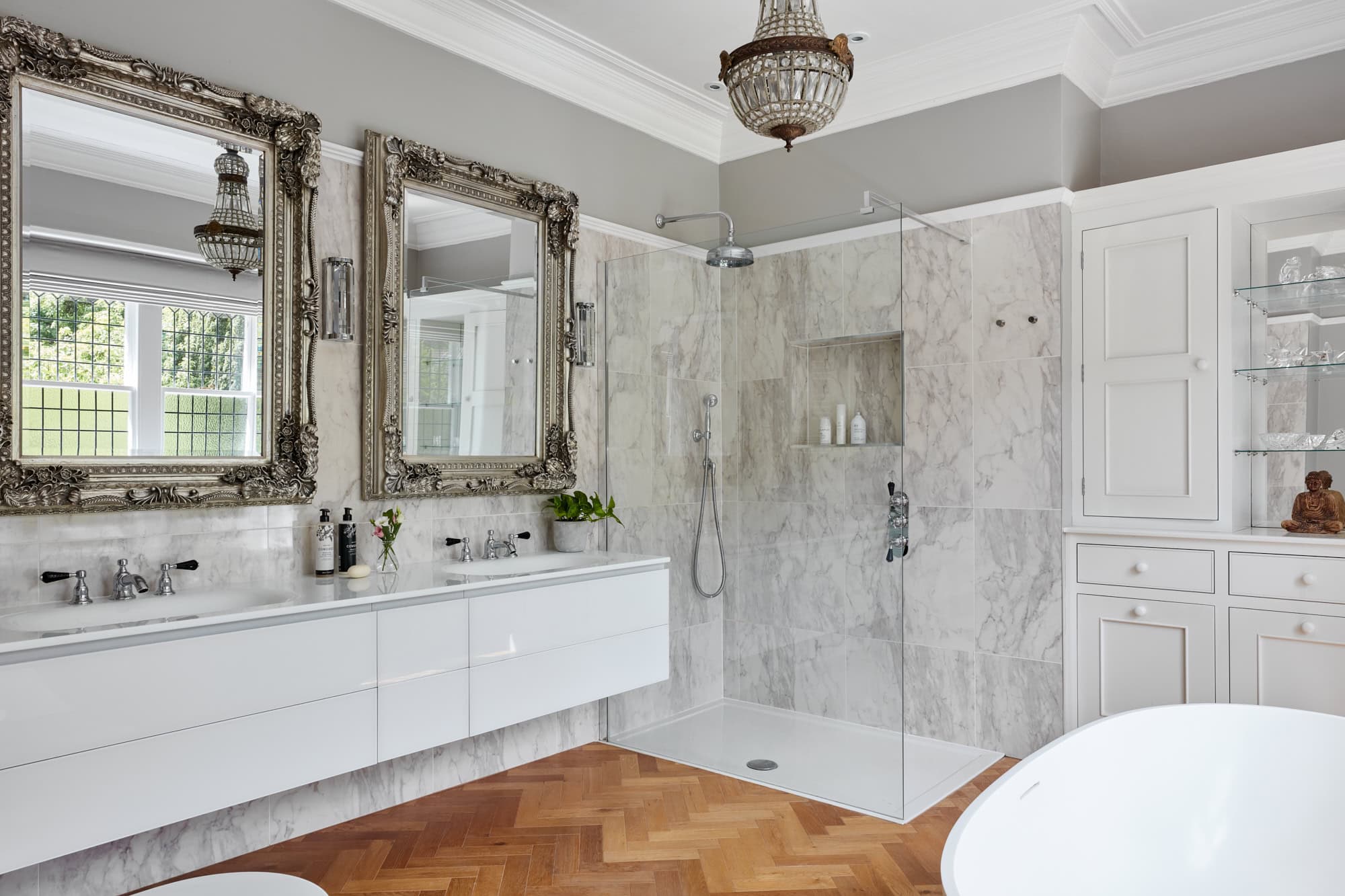
But if you take away one message from this blog – go big! If I’m creating a design for a period property with high ceilings, I’ll look for a chandelier or pendant light with a large drop. It draws the eye up and literally makes you stand up tall, just like the white Flos Skygarden pendants light in my pink living room.
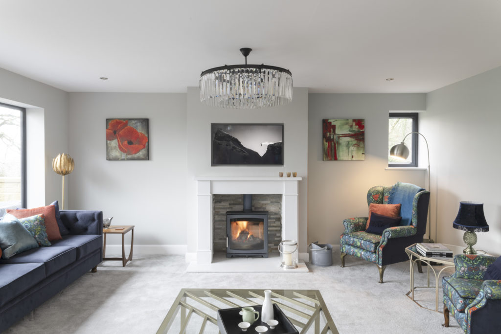
In a modern home with low ceilings (like in the image below), I look for extra wide pendants that bring volume and drama to the space. I love the crystal drop chandelier in this modern living room. It draws the eye up but doesn’t get in the way of the stunning views from the windows of the Yorkshire countryside.


It’s the same with lamp shades on your floor or table lamps – don’t stint on size, go big and don’t be afraid to go bold with the colour and pattern too. Lamp shades are great for echoing design details elsewhere in the room.
Here’s one I prepared earlier
It might be easier for me to explain what I mean with a little show and tell. I could go mad and show you a few different rooms, but I’ve restricted myself to the living room this time. Lighting design is a huge subject so I’m sure I’ll come back to it again, for now, though, here’s a living room in a contemporary family home in Ilkley that I designed back in 2019.

Contemporary family home in Ilkley
I’ve chosen a couple of photos from the shoot I did with Heidi Marfitt last year. You might have seen them in my social media feeds, and I’ll be adding them to my website soon – I’ll keep you posted on when that happens.

This north facing room is used a lot by the family, TV watching, reading, chatting, hanging out – the usual. It has fantastic natural light thanks to all the floor to ceiling windows on two of the walls.
All this natural daylight meant I could go for one of my favourite bold, jewel colours for the walls – a deep, dark green paint, especially with the room looking out onto the lush, green Yorkshire countryside. And the family love hanging out here – it’s such a great space.

Final thoughts
It’s funny how you when you start analysing a room you see just how many layers there are to it, even when you’re focusing on one element – the lighting in this case. There are so many different, equally important decisions to make, each one depending on another.
But once you start the process of looking at what you need from a room and at its current limitation, the way ahead is open to create a fantabulous space.
I hope you’ve enjoyed this canter through the basics of a fab lighting scheme and a few precious minutes away from daily life.
I’ll be back next month with a blog all about window treatments, so if you have any questions you want me to answer, please get in touch.
Have a great weekend, Ann Marie
Photography by Heidi Marfitt, Colin Poole and Mark Richard Harrison.
