How to create a haven of peace and tranquility
Is it me or did March disappear quickly? I mean daffodils are springing up everywhere, Easter’s round the corner and the children have had three weeks back at school. Add in the vaccine roll-out and there definitely seems to be change in the air.
This all sounds incredibly positive, doesn’t it? But I guess it’s not that simple? I get the feeling that people are obviously happy that restrictions are being lifted (fingers crossed) but also uncertain about what this new normal might look like.
If I’m honest, I have mixed feelings about it all too. Like so many of you, the past year has caught up with me and it feels like my batteries are at an all time low. And I know I’m one of the lucky ones – my family is healthy and our jobs are intact.
So here’s to being grateful that there is hope in the air and the end is in sight. But let’s not ignore the fact that we’ve had one hell of a year (even if it’s just normal levels of rubbish).
All hail our front line key workers, and my heart goes out to those who have lost loved ones
With all that in mind I thought I’d share this master bedroom makeover with you, because sleep (or lack of) is one place where our worries show up. Plus it was World Sleep Day last week. Yes, there’s a World Sleep Day. Who knew? Unless you work for the World Sleep Council, I guess. (Yes, I just made that up.) Let’s dive in to the detail.

This design project was all about creating a haven of peace and tranquility. A place to escape to at the end of the day. Screen and child free. It was also part of the same design project I featured here the other month, a super stylish family home near Ilkley Moor.
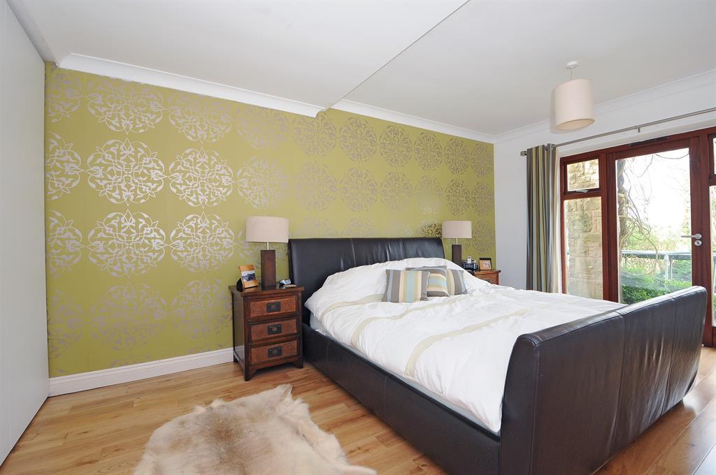
Check out the before photo from Rightmove. After photography by Mark Harrison and Wharfe & Moor.

The brief
The master bedroom is on the lower ground floor which meant that some parts of the room had plenty of natural daylight, but other areas like the dressing room area weren’t so lucky. I designed a layered lighting scheme that would boost the daylight from the floor to ceiling windows at the far end of the room, while making sure the darker dressing room area had light in all the right places. (Read my blog all about layered lighting schemes here).
And secondly I went big on storage, because if you want to create a calm, clutter free space, you need lots of storage. Smart, stylish storage. It’s human nature to leave something on the side if there isn’t a natural home for it. So think through your average day. Everything from where you leave your bag and keys when you come home from work to where you take your make up off and the kind of clothes you wear for your daily life, and not the SITC fantasy life you wish you lived. (Oh, just me then?!)
Design Focus
Design – A calm, serene feel with more than a touch of luxury and inspired by the garden views
Lighting – A simple layered lighting scheme with lots of downlighters, matching pendant lights and stylish bedside lamps.
Storage – Beautiful bespoke cabinetry with mirrored fronts to keep the clutter at bay

“I had never worked with an interior designer before but contacted Ann Marie when we decided to rebuild our house to make it work for us as a family. My default is to prefer a neutral palette, but I knew that I needed to add some colour the greys that I love.”
Design details
This bedroom called for bespoke joinery. I asked Wharfe and Moor to build a bank of cupboards, drawers, shelving and a dressing table (next to the sole window in this area). Painted a warm grey and with simple drawer pulls and handles it’s sleek, stylish and there’s acres of storage space for clothes and shoes. Perfect.
(Images from Wharfe and Moor)


This dressing room area doesn’t have a huge amount of natural light, but recessed downlighters, particularly above the dressing table combined with two pendant lights and mirrored fronts bounce the light around. And because we used an antiqued mirror, they are gentle reflections, rather than being super shiney.
Colour and texture
The walls in the dressing room area are painted Pavilion grey, a soft grey by Farrow & Ball but if you walk further into the bedroom area the colour scheme picks up a notch, with the Laura Hyde wallpaper behind the bed. I love the jolt of colour after the muted greys of the dressing room and it links so well with the views from the floor to ceiling windows.
Then I brought out the greens and mustard shades from the wallpaper into the soft furnishings, including a faux fur throw, cushions and dressing table chair.
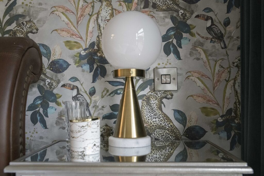
I love the mirrored bedside cabinets because they bring a touch of glamour and reflect the light beautifully. They also have plenty of storage for glasses, books, alarm clocks and lights. Practical and beautiful.

The layered lighting scheme is perfect for this large space. I positioned recessed downlighters throughout the room and added a central white drum shade and bedside lamps. And the light switches by the bedside mean you can control the lighting without having to leave the comfort of your bed.
The white extra-wide drum shade adds to the contemporary style and I opted for white because it blends seamlessly with the white ceiling and doesn’t get in the way of the garden views, and the beautiful views beyond. I often use light fittings to make a statement but there are times when you need to know when to pull it back and let the surrounding shine.

Final thoughts
I loved this design project. The room has a luxurious, serene feel and there are so many little details to feast your eyes on. From the botanical wallpaper behind the bed to the mirrored bedside tables and the beautiful workmanship of the joinery in the dressing room. And my clients love it, which is the really important bit!
Have a think about your bedroom, is the haven of peace and tranquillity you want it to be? Give me a call if you need help giving it a makeover. I’m taking bookings for Design Consultations from the end of May.
Thanks so much for reading and keeping in touch, I hope you have a lovely Easter break and lots of good sleep!
Ann Marie