Tour my Interior Design UK
shortlisted house – an Edwardian conversion near Ilkley
Put the champagne on ice! The children are heading back to school, it won’t be long before we can meet friends for a drink (or two), the clocks are changing and yes, awards season is here. The countdown clock is ticking at AMC HQ.
But let’s put lockdown and Covid to one side for the moment and dive into my interiors news, and it’s a biggie this month.
Shortlisted: Interior Design UK, International Design and Architecture Awards 2020
I was absolutely thrilled when I found out that the Edwardian family home project had been shortlisted in the 2020 International Design and Architecture Awards (Interior Design UK category). Covid might have delayed the voting and banished any thoughts of getting glammed up for a night out at the awards evening in London, but the good news is that voting has now opened.
Unlike other awards with a panel of experts making the decision, it’s all down to the public. Your vote really does count! You have until 19 March 2021 to vote for me and I’ve helpfully popped the link below:
https://www.thedesignawards.co.uk/category/design-architecture-entrants-2020/
It feels really uncomfortable asking for votes, but it’s kind of necessary when winners are chosen by the public. So I thought I’d ask nicely and then take you on a tour of this stunning family home and show you some of my favourite details.
Some of the images might be familiar, especially if you saw the feature in the Yorkshire Post magazine at the weekend. Being shortlisted is fantastic, but hearing Rachel, my client talk about the project with such positivity is what really counts.
I hope you enjoy the tour!

Why enter this home?
I entered this home into the awards because I’m really proud of it. It was big, bold and challenging and it’s one of the biggest projects I’ve worked on. I learned a huge amount over the nine months we spent transforming it – from the basement to the attic. I worked closely alongside the builder, the trades, kitchen designers, flooring supplier, stained glass designer – it was a team effort. It needed to be because nine months is a pretty tight turnaround for a project of this size.
Plus, my clients were fantastic. They were so supportive and were always around, which really helped with the day-to-day discussions and decision making. There are always challenges and problems to overcome in a renovation, but having clear, open and honest lines of communication really helped.
I was also able to really flex my creative muscles, because my clients were happy to be bold with colour, pattern and texture throughout the house.
Interior Design highlights
There is so much to love in this home, and some of the photos will be familiar from social media, but I’ve tried to pick out some images you might not have seen before. I’ve also added in a few thoughts about some of my favourite details.
Let’s get started, not at the top or the bottom, but somewhere in the middle of the house and a very important room. The master bedroom.
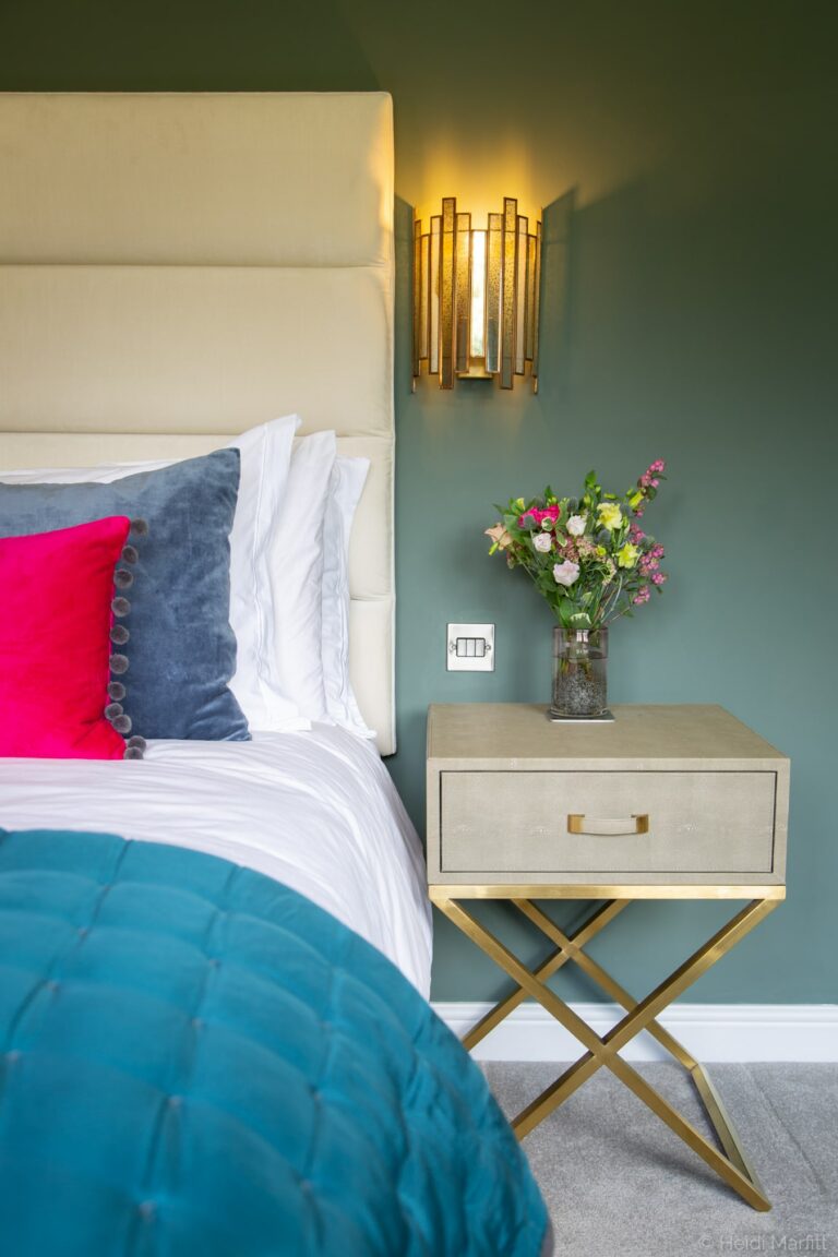
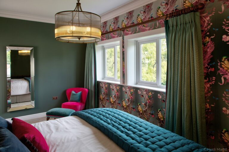
Master bedroom – The stunning Kit Miles wallpaper was the starting point for this scheme. I’d met Kit at a trade show about six years ago and was so excited to have a client who was keen to embrace pattern. Once I’d chosen the wallpaper, the rest of the room fell into place. Hot pink occasional chair, duck egg blue curtains, wall mounted bedside lights. Grown up and luxurious.

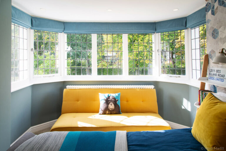
Tween boy’s bedroom & en suite – I love the tiles in the son’s tiny en suite. To be honest, I just love the whole room. He was only 10 when work started on the house and he’s now just turned 13. He’s very much the teenager now which meant the room needed to grow with him. The starting point was the colour scheme – blue and yellow – the colours of his football team, but I’m delighted we managed to decorate the space without it ending up looking like the football club fan zone.

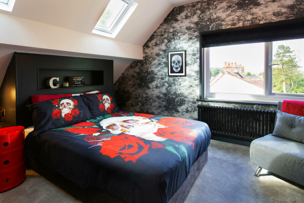
Cool teen en suite – I love the daughter’s attic bathroom because it’s such clever use of space. This room was for a cool teenager who did NOT want anything girlie, so we embraced black, white and red and thought laterally when it came to some of the fixtures and fittings. The wall mounted lights in the en suite are outdoor lights but are perfect for this black and white scheme and I love the feature wallpaper, Mitoku by Black Edition .

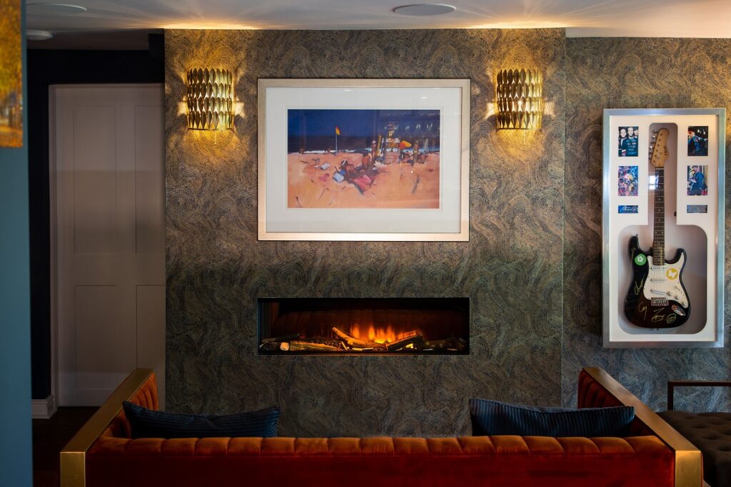
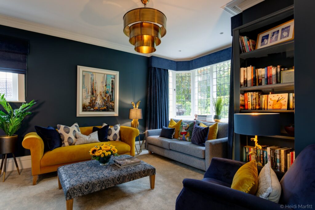
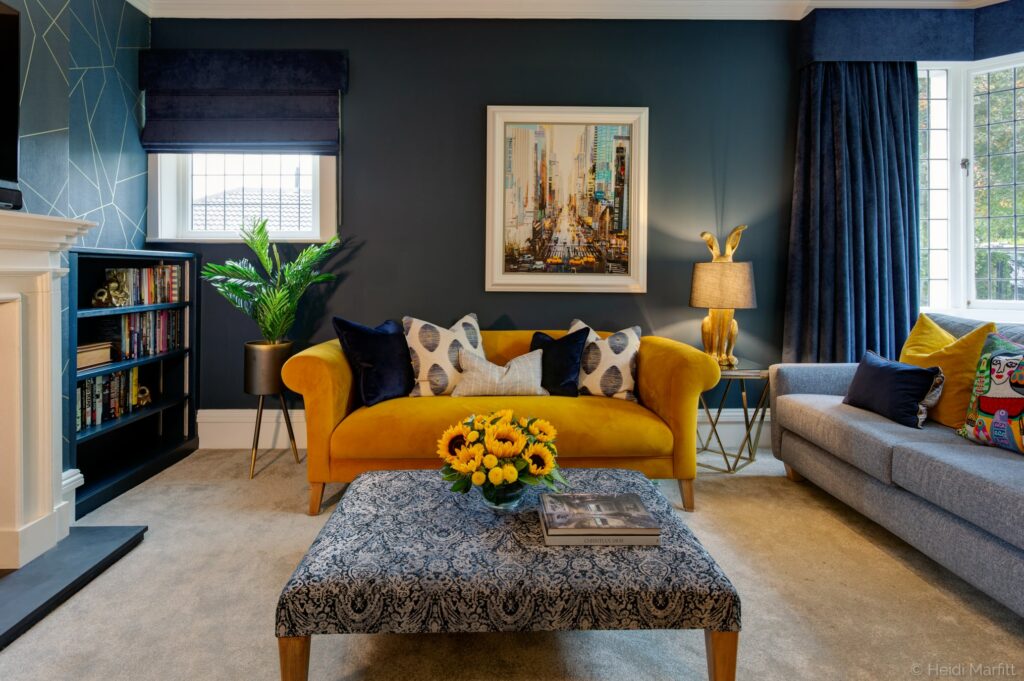
Navy formal living room – the ochre sofa is a big favourite in this room. I love ochre and navy together, it’s such a fantastic colour combination. It also ties in really well with the Manhattan street scene print behind the sofa, complete with yellow taxis. My clients bought it on a trip to New York a few years earlier but never found the right spot for in their old home.
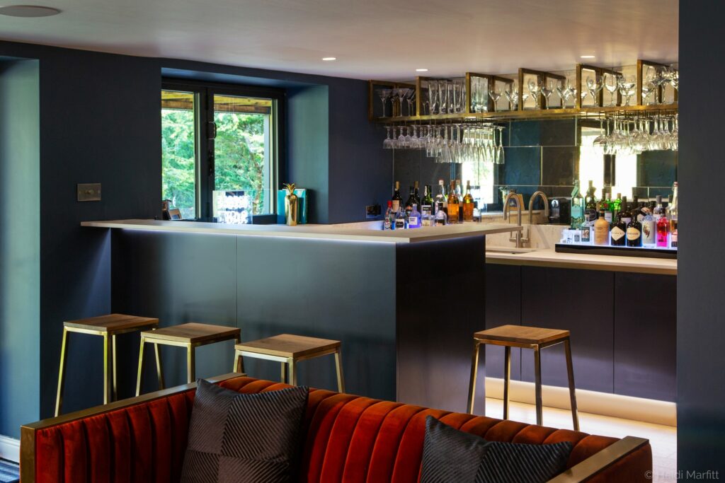
Kitchen – I love the gold accents throughout this open plan room, especially the gold lights over the island. They just lift everything and show that family kitchens can be glamorous too. Kitchen cabinet handles, light fittings and bar stools. Little touches of gold everywhere.


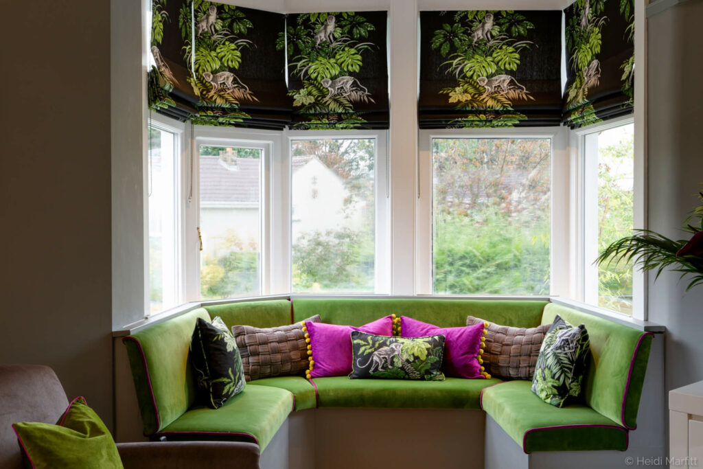
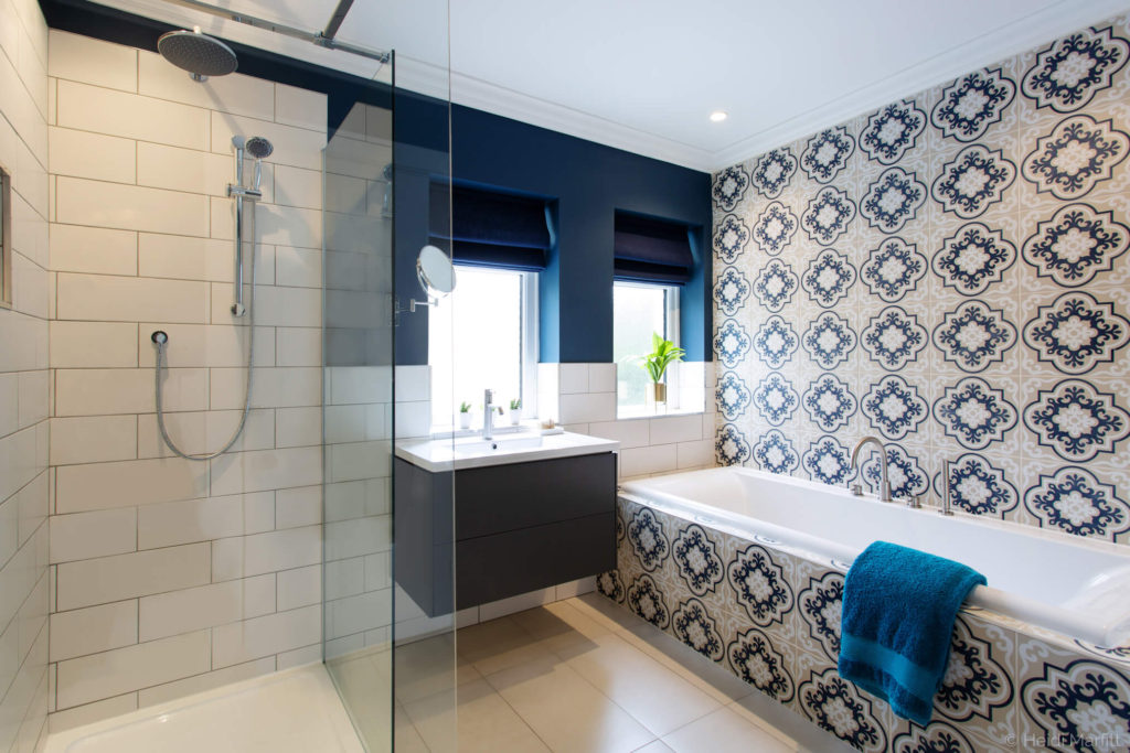
Those were my favourites, but let’s take a look at a few other corners while we’re here.

And finally
Firstly, thank you for reading and an even bigger thank you if you’ve clicked the link and voted for me. I really do appreciate it. I know that I’m lucky that I’ve been able to carry on working with clients over the past few months, bringing a sense of normality to a strange situation. These projects include an iconic Ilkley property that I can’t tell you too much about at the moment, but it is very exciting. Watch this space!
Till next time, Ann Marie