
A clever combination of colours in interior design can create harmonious spaces which look and feel great. Colour can also change the sense of space, amplitude and dimension of a room. For example, low ceilings can appear higher and long spaces can be transformed into cosier areas with colour choice.
- How do you make a small room feel bigger with colour?
One of the main elements to consider when decorating a small space is to ensure it is clutter free to allow more of a flow throughout the space, yet there are other tricks to make the light go further, the rooms feel bigger, and the whole space feel roomier. It is about getting the decor and colour partnership exactly right.
While the accepted wisdom is that white reflects light around a room to make it feel more open there are still considerations you need to make before jumping in.
The first thing you need to think about is the orientation of the room. North facing rooms need warm colours, whether you favour inky hues, jewel like brights or neutrals. Brilliant white is a very cold colour and therefore not recommended. Neutrals need depth in order to give them context and heart. If neutrals are your thing, consider warm sands, taupes and muted pinks in lieu of white.
Pay careful consideration to temperature and intensity of colours. For example, whites, neutrals and greys with blue undertones can look cooler in rooms which do not benefit from natural daylight so to avoid an overly cold looking room, opt for a warm undertone. Ensure you test your colour swatches in your chosen room alongside your fabrics and flooring sample, and study how it looks on both sunny and overcast days.
Warm, mid-tones can also help to absorb shadows to offer a more seamless look. Think jewel-like teals, yellows, and greens – these are colours of positivity and therefore offer an instant lift to a room to make it feel much brighter and energized.
Using different shades of the same colour can also create a seamless look helping to expand it visually. For example, pairing a light cornflower blue with slightly moodier blue accents and textiles will make the space feel cohesive.
Emphasising the height of a small room allows the room to feel bigger. To do this opt for a bold headboard in a richer colour to draw the eye upwards or consider the use of vertical strips to frame the bed taking it right up to the ceiling. A statement pendant is also a wonderful way to draw the eye up, while enhancing the lighting scheme.
Avoid bulky furniture and storage as it blocks light and walkways and go for custom fitted storage in one colour. The clean lines help to blend into the space.
2. How do you add the illusion of height to low level ceilings?
Low ceilings are perfect for snugs or living rooms because they add cosy appeal, but they can provide a headache for other spaces in the home and so colour choice is key.
Lighter colours can enhance a feeling of spaciousness, but it isn’t one size fits all and painting your ceiling lighter than the rest of the room won’t add height. Instead, you can heighten a room by taking your wall colour to around 10cm (about 3.94 in) below the ceiling or adding a cornice and painting everything above it a lighter shade. The extra band around the top can make the room appear taller.
Another trick is to add a coffered ceiling which can facilitate lighting. In this living space, a rich, transformative teal colour has been added to the walls to make the room less bleak. Clever coving was added with LEDs to make the ceiling appear higher and the room look longer while accessories and art add even more warmth.

My advice is to treat each space with bespoke thinking and look beyond the low ceiling exploring how colour can be used elsewhere in the room to provide a feeling of added height.
3. How do you lengthen a room with colour?
If you have a short hallway, office or sitting room, choosing light colours for the walls and a dark wooden floor or runner can create space and length. I would advocate taking this a step further and adding a darker hue to the ceiling and the end wall too. The light walls will expand the room out, while the eye follows the long line created by the dark ceiling.
4. How do you make a space feel shorter or more compact?
People rarely talk about making a room feel smaller or more compact but plenty of homes, often period properties, include thick walls, high-ceilinged rooms, spacious hallways, and big bay windows. These can present as cold and unwelcoming without considering visual warmth. Opting for stronger colours on wall surfaces such as navy and rich greens can work effortlessly to make a space feel much cosier. This is particularly important for entryways given you wish to create a warm welcome.
If you have a room with two long walls and wish to make it feel shorter or more proportionate, then keep most of the space neutral and light and add a darker hue to the end wall of the room. This will help the space feel more intimate and compact. Rich, intense colours such as mulberry jam or deep orange can also make a room feel more cocooning while deep navy blue offers sophistication and calm. Dark walls serve as a stunning backdrop for furniture, wall art and lighting for a sophisticated scheme.”
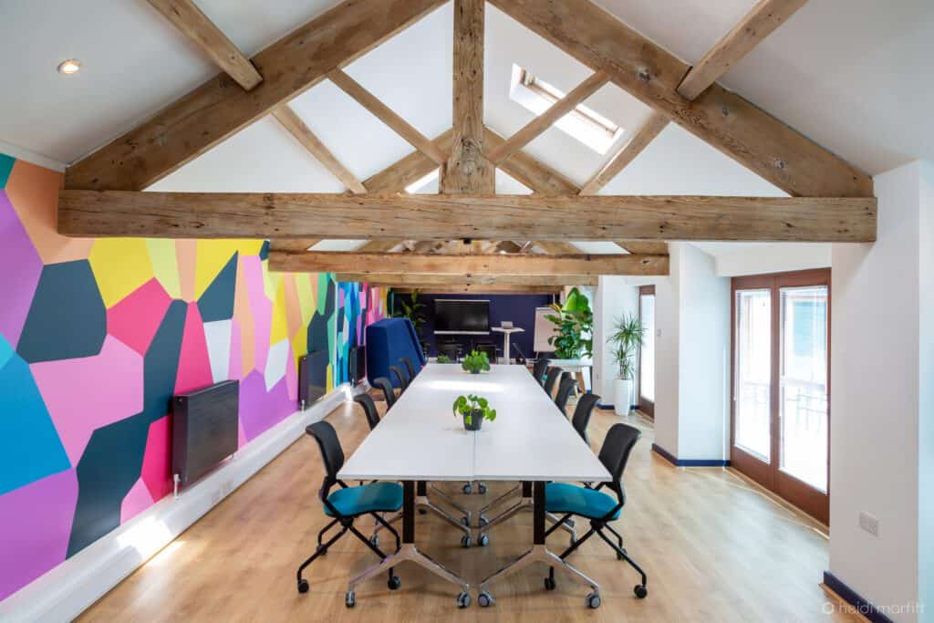
For large spaces, such as entryways and offices, you may wish to distract the eye from the long nature of the room. Colour can make a focal point, so the eye is being drawn. Here a lively geometric print helps prevent the room from feeling squeezed from the side while the navy wall at the end also helps to shorten the space and hide the TV.
5. How to conceal harsh angles and fiddly bits?
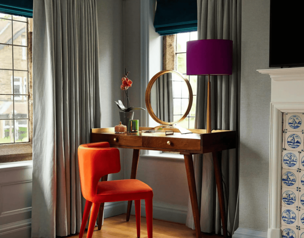
Period properties and older homes are uniquely beautiful, and it is important to celebrate these features. Bedrooms that include eaves, small alcoves and fireplaces may prove ‘fiddly’ but colour theory can help to make them beautiful.
Here, the alcove to the side of the fireplace becomes a celebrated feature in this master bedroom. By carrying the wallpaper all the way around the room, the focus is on the stunning dressing table which has been chosen to fit perfectly and to make the most of the daylight flooding in from both sides, making it the perfect place for a dressing table.
The small, round mirror enhances the feeling of space and bounces the light around, and the sleek orange chair complements the blues on the walls and woodwork and the wooden tones, which contrasts beautifully against the textiles and fireplace tiles.
From the walls to hero pieces of furniture, the correct use of colour combinations can be hugely powerful. Colour goes much deeper than aesthetics, impacting mood by giving a room a flush or energy or a calming effect and when done right, could shape our perception of space too.
If you have a project you would like to discuss or to learn more about how AMC can assist you, please contact us here. You can view our portfolio here.